Travel and Leisure: Automobile Edition
Written by Bastiaan de Vries
Since their invention automobiles and architecture have been intrinsically linked, especially in a prosperous and industrious country like the United States. Ever since the early 1900s, when the first Fords started rolling off the new assembly lines in Detroit, Michigan, architecture in this country has done well to keep up with, and take advantage of, these new mechanized and modern examples of industrialization. Architects of the day were quick to figure out how steel, concrete, and glass could figure into an style of architecture that was faster and cheaper to build, and would give more people access to new ways of living and working.
After World War II, with a renewed sense of hope for the future, car designers went in extreme directions with fins and chrome ornamentation, eager to indulge in societal desire for movement, speed and sleekness. At the same time, in the world of architecture the windows got bigger, concrete arches started spanning greater distances, and structural walls became a thing of the past. It was a race to see who could deliver the most modern and stylized version of the future to the public.
Architecture, during the turn of the century, was finally able to keep up with the frenzied pace of modernization. Not only that, architects were finally starting to get ahead of the pack and dictate exactly what modern life should look like, and function as. Wherever the modern automobile could take you, the Modernist architect would be there to greet you and take care of you in a similar futuristic and hopeful fashion. Or, like in some of the examples below, your experience of the future would start right in the showroom, before you even got on the road.
Although Modernism by the great architects working in the field was often exemplified by the philosophy of “less is more,” and ornamentation was seen as taboo (or a crime, if you will), day-to-day architecture in the mid-twentieth century flirted heavily with the idealistic, exuberant space-age zeitgeist. In Googie style roadside architecture, an over-the-top aesthetic popularized in Southern California, ornamentation was celebrated as a structural element that could dominate the entire building much like chrome and fins did on a Cadillac Eldorado. The more your building looked like something that could take off in flight at a moment’s notice, the better. Especially if it had ample space for big neon signs and advertisements.
Since 2021 is all about Travel & Leisure at Docomomo, we figured we would take a closer look at some of the amazing (and less publicized) Midcentury Modern examples of architecture that involve Northern California’s favorite mode of transport: automobiles. These structures pepper the map and are often forgotten about, so if you know of any good examples please read below how you can get in touch with us so we can include them in our next feature.
Without further ado, here is a virtual tour of Northern California’s unique and interesting Midcentury Modern roadside architecture:
4716 Auburn Blvd, Sacramento (https://goo.gl/maps/5LqEUf4xGdWiyQSz6)
This Orbit station is, shape-wise, like some of the others we’re going to see down on the list, but here the stretched out canopies are strong enough to support themselves due to their hyperbolic paraboloid form, giving the structure an otherworldly, space-age feel. Like huge concrete shards stretching out to match the curved line of the horizon.
Modernist architecture really was about making possible the impossible, using the newest available industrial materials. This station in Sacramento, built in the early 1960s, is a shining example of a modern style of architecture that was bold, and dared to predict and dream, even when it came to pedestrian matters like pumping gas into your car.
Big oil corporations these days don’t give the same kind of attention as before, but the spaces you find yourself in can have a profound effect on your day-to-day state of being, and as such, they should try to reflect an ideal, a sense of hope and excitement for the future. This station certainly achieves that.
2025 Broadway, Sacramento (https://goo.gl/maps/eyJzKiihYu5KWNT47)
This A-1 Auto Repair shop in Sacramento is a real beauty. There are a large number of buildings with this particular roofline all over the state. Public records found online state that it was built in 1968, and it features some amazing steel structural supports (and the Bay Area knows a thing or two about interesting steel structures). Architecture that incorporates the structure of the building into the design is one of the key tenets of Modernism, and this is a great example.
Automotive service doesn’t need to happen in a nondescript grey box—in a structure like this, both customers and employees get to experience and enjoy the positive effects of architecture that is meant to inspire and excite. Plus it catches the eye of any passing motorist looking to spend some money - advertising strategies that incorporate architecture in such an aesthetic way have sadly fallen out of favor these days.
9517 E Stockton Blvd, Elk Grove (https://goo.gl/maps/KbBQisnntqxCfUFF6)
This structure was built in the late 1950s or early 1960s for Bob Batey, as a Chevrolet dealership. Interestingly, Bob Batey was the charter president of the Elk Grove Rotary Club. So there’s a connection to the car showroom in Vallejo, coming up next on the list.
The original design seems largely intact, aside from the large banner stuck to the front of the facade. It looks a little plain now compared to the cool rendering in the ad above. Overall the whole operation looks to have seen some better days, now functioning as an RV dealership. Although, nothing says Travel & Leisure quite like an RV does. Travel & Leisure: the American way!
1515 Solano Ave, Vallejo (https://goo.gl/maps/NvEDjegTw6Vk8VBR8)
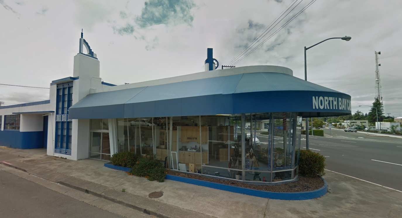
Built in 1945 as a Buick showroom for a gentleman named Herman Freudenberg. This building is peculiar, not just because it still looks like a perfect time-capsule of all that makes 40s architecture so exciting, but if you focus on the design you’ll notice some interesting symbols at the top of the building—namely those of the Rotary Club and the Freemasons. It doesn’t happen often that you see such explicit references in everyday architecture like a car showroom. Usually this practice is reserved for buildings more closely connected to the organizations, like temples or buildings that otherwise serve the community in a more formal sense. Regardless of the symbolism, the actual design of the building is a great example of the tipping point between Streamline Moderne and the Modernism of the 1950s—the chunky and rounded concrete shapes remain, but large expanses of glass start to take the center show.
1891 Market St, Concord (https://goo.gl/maps/UV1UJpqbuNe8D9Bn9)
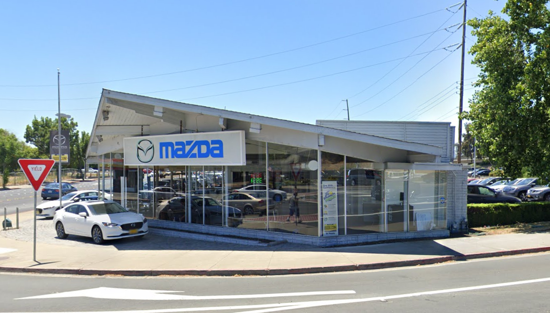
Here we have an inverted example of the showroom in Hayward (further down the list). Instead of the wings of the building going up like a butterfly, these are going down, as if to mimic the wings of a fighter jet. This was built around the same time, in the early 1960s. It employs similar techniques, just executed slightly differently and with different materials. The structure of the building still pierces through the facade, but this time it’s sturdy-looking wood, giving it a post-and-beam look reminiscent of Eichler homes of the time. Directly past the facade and into the structure you can see the steel pilotis (hello Le Corbusier) holding up the roof, allowing for the great expanses of glass to perfectly showcase the best the automotive design world at the time had to offer. Any car would look good in this building.
The winged, public part of the building is set at a 45-degree-angle to the rest of the building, which has seven vehicle bays and is clad in painted brick and wood siding.
3009 Ashby Ave, Berkeley (https://goo.gl/maps/BQqnFnmrZxenWwFw6)
Coast Gasoline/Bridgeway Service in Berkeley has been independently owned since the early to mid-1940s. It operated as a Flying A station before that. The Carvalho family started the business in Oakland (located on MacArthur) as Bridgeway Service over 70 years ago, and named it so because they were the last gas station one would hit before traveling over the Bay Bridge towards San Francisco. When they moved to their current location on the corner of Claremont Blvd. and Ashby Ave., they kept the name and they’ve been a staple of the neighborhood ever since. You can catch a glimpse of the amazing Claremont Hotel and Resort in the background, another impressive Berkeley landmark.
If this gas station has you smitten, you can buy a cool art print of it at the website of artist Mike Hampton.
2037 Durant Ave, Berkeley (https://goo.gl/maps/JSyZGPJ7BS8vMXYJ7)
Built in the 1940s as a Lincoln dealership, this is a nice example of that typical 40s, rounded and stout looking architecture. It has some features that signal what’s to come in the decades ahead, like the squares pierced out of the roof, and the sharp, angular upright wing on the side of the building (which used to be a sign to advertise the business to passing motorists). But nothing here is too excessive, it still feels relatively understated;, although surely it looked better in its original color scheme, as opposed to this drab, race car grey and red combo. The large rectangular windows set into a circle pattern that disappears into the service bay is a particularly interesting touch of design. It’s straight out of the 40s and looks dignified and classy. Who wouldn’t buy a nice new Lincoln or Mercury car at this location?
1321 Gilman St, Berkeley (https://goo.gl/maps/qwSX7U7TUmTWWkWLA)
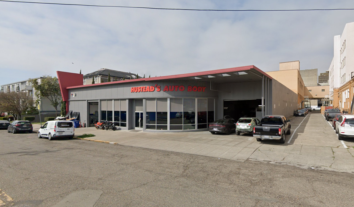
Built in 1940, this auto shop currently looks as if it wants to disappear into its surroundings with it’s gloomy grey monochrome paint job. Like most other roadside architecture of its era, it would’ve originally sported a bright color palette to delight and entice customers. Looking at the vehicle bays, the one closest to the entrance has some unique moulding to spruce up the opening. The two bays next to it are simple squares, so they might be extensions to the building added after the original construction (available aerial photographs don’t shed much light on it, unfortunately). They also don’t have that lovely texture as a result from painting layer after layer over brick.
In the end it’s all speculation, as with most of the other structures on this list the available information is extremely scarce. It’s fun to look for clues and speculate about architecture, though!
Regardless, the canopy is the real standout here—it looks great from any angle, and seems almost economical, or restrained (compared to some of the other canopies in this list) in its functionality—it fits exactly one car underneath it. As if to say, “you have my undivided attention.”
2301 Santa Clara Ave, Alameda (https://goo.gl/maps/HqchFx6tDkBx57Le6)
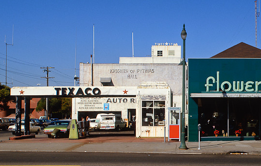
We’re going a little further back in time, appropriately on the island of Alameda. This little island in the bay is home to a lot of great, sort-of abandoned buildings, including this Streamline Moderne gas station. It harkens back to a day when fewer cars roamed the streets, and more time could be spent luxuriating on things like pumping gas in elegant surroundings. The two fluted columns holding up the canopy are supremely classy, as is the overall square-but-round design language. Looks like it was built in the 1930s and was still in use up to the 1990s (see photo below). It sat abandoned for years after (Google Streetview shows it still fenced up and deteriorating in 2008) but the little gas station that could was ultimately renovated, relatively recently.
Image found at https://flic.kr/p/ati5wr
It’s apparently a local landmark, so hopefully something good will happen with this little gem of a station - although some internet sleuthing uncovered a pretty uninspired looking vision plan (from 2010 - here) for that part of Alameda. In the plans both the gas station, and the gorgeous looking flower shop next door would be preserved, though, so that would at least appease us architecture aficionados!
2301 Encinal Ave, Alameda (https://goo.gl/maps/ja5xBDEbg5ynrGWJ8)
This gas station, down the street from the previous entry in Alameda, is a real beauty. The same design shows up on a few other gas stations around California, but none of them seem to have the little tower in the center as a feature. An old photograph (below) shows it was a Seaside gas station. The Seaside Oil Company started in 1898 and at one point was selling its gas to over 900 retail locations. The brand went under in 1973, after being bought by Phillips Petroleum. It looks abandoned at the moment, but hopefully someone will step up and renovate this beauty and it can be of use again.
Image found at https://flic.kr/p/3LGiMp
22196 Mission Blvd, Hayward (https://goo.gl/maps/MkrtDdDP1aWX4oB38)
Built in 1960. There are a lot of interesting buildings on this strip, but of particular note is this automobile showroom. Modernist construction materials are used here to exciting effect, creating a see-through, winged structure (it has what is called a butterfly roof) that seems ready to take flight. The only thing holding it back seems to be the huge, square warehouse that it's attached to. The steel structure pierces through the facade of the building as if it was made out of the sharp quills of a bird’s feathers. This is a great example of a utilitarian building taking the shape of something architecturally interesting, to enhance the excitement and experience of its users. Thank you industrial construction elements!
4 S 11th St, San Jose (https://goo.gl/maps/VvayLq5yA8duFkXx6)
This gas station in San Jose is like a giant boomerang made out of steel, with the sharp edges squared off. The structural supports are hidden by the design, covered in plastic looking shields, giving it a more angular, weighty feel—like daggers stuck in the asphalt. This station feels safely anchored to the ground, in no danger of flying away (as opposed to our next example!).
2149 Alum Rock Ave, San Jose (https://goo.gl/maps/mpPEs97dtrbJfMDPA)
This gas station is a very cool-looking interpretation of space age architecture. It’s a literal wing. There are nicer examples of this particular gas station in Northern California (some with three supports), and some altered ones, but I liked this one for the faded color scheme, and the quality of abandonment. There’s something particularly intriguing about a forgotten Googie-style piece of architecture, especially in these days of the pandemic. This giant canopy would make a great make-shift shelter! Stations with this design were built in the 1950s to sell Wilshire Gas, and they are all over the California map, so try to find your local one and snap a photo!
Wilshire became part of Gulf Oil in 1957, and continued to build stations with this design until the late 1960s. Going off the design of the Chevrolet Impala look-alike at the station, one could hazard a guess that this drawing was made to depict a scene somewhere in 1959 or 1960.
Image found at https://flic.kr/p/4BBhc2
3455 El Camino Real, Santa Clara (https://goo.gl/maps/KjGUA7omgF4dTArJ7)
This touchless, all cloth car wash is an amazing example of Googie architecture. The steel frame, with wires safeguarding structural integrity, sits on the tarmac like a giant mechanized caterpillar, ready to swallow up your car and polish it back to showroom condition. There are several of these in use in the peninsula (Lozano Car Wash on Grape Avenue, Sunnyvale and Lozano Brushless All Cloth Car Wash on West El Camino Real, Mountain View), and they all look to be in great shape. Who knows if John Lautner, when he designed the Googies coffee shop in the 1940s (from which the architectural term derives) could predict structures like this would be conceived in its name. It’s a fascinating architectural legacy, one that is tied tightly with automotive culture, the race to space, and the rise of the Atomic Age.
2211 Monroe St, Santa Clara (https://goo.gl/maps/GN3X2gBuziFXQob68)
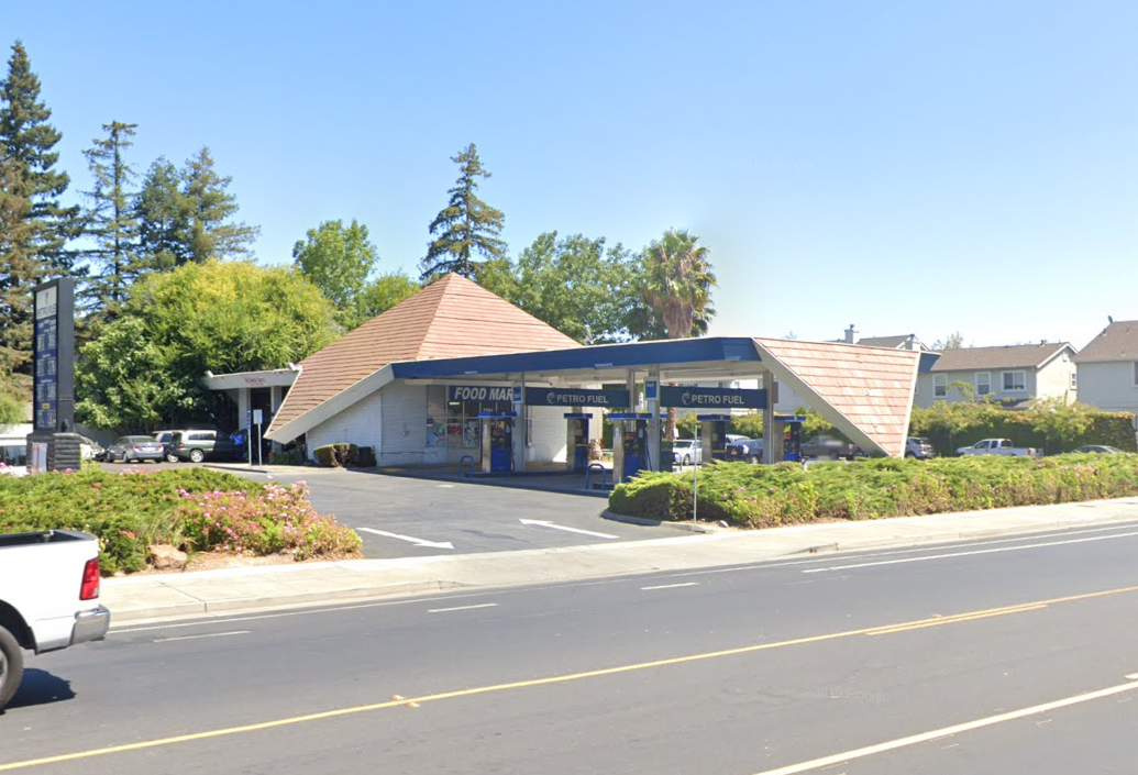
Finally—a gas station with some documented architectural pedigree! Aaron Green designed this station, along with an adjacent shopping center that has sadly been demolished. Before venturing out on his own, the architect spent time at Taliesin with Frank Lloyd Wright, which, when looking at photos of the shopping center, becomes readily apparent. This station, though, looks like something else altogether. It’s a gorgeous building, with a strong structure that folds like paper from the sky, down towards the ground. The Bay Area loves a good pyramid (Hi Transamerica Pyramid!) and the wood shingling is a fine nod by the architect to the Bay Tradition vein of Modernism.
Please go to the website of Aaron G. Green Associates, Inc. to see some other spectacular work.
901 Pacific Ave, San Francisco (https://goo.gl/maps/FPXA1pzkL8fmhTh97)
Following the last entry, here is another structure with some big names attached to it. Campbell & Wong Associates designed this station for Mobilegas in 1956. It’s one of the classiest looking stations on this list, for sure. It also looks relatively unchanged, referencing the small photo in John and Sally Woodbridge’s guide “Buildings of the Bay Area'' from 1960.
From Buildings of the Bay Area (available here)
It’s a dark and sleek looking little building, perfectly in tune with what Modernists were designing at the time—very Miesian in its use of black painted steel—but with a pitched roof that gives it some great Nor-Cal character.
Campbell & Wong Associates, headquartered in San Francisco, was a very prominent firm during the turn of the last century— they were mostly known for their residential work but their list of buildings also includes great Travel & Leisure examples like the Dinah’s Motor Hotel in Palo Alto (1957). They were actually part of the famous Case Study House Program in the 1960s, designing house #27, which sadly remains unbuilt.
A postcard featuring Dinah’s Motor Hotel in Palo Alto (1957), as found on eBay
Architecture firms headed by a person of color are rare even today, but exceptionally so during the 1950s, which makes them an exciting bookmark in the architectural history of the Bay Area. By all accounts Worley Wong was an exceptional architect, but these days it’s often hard to recognize the work that he did. For example: California governor Gavin Newsom was responsible for this insensitive remodel only a handful of years back.
As another interesting side note: the Environmental Design Archives in Berkeley states that “Campbell is also credited for being one of the first architects to utilize the A-Frame to construct a house, which was later utilized in one of their most popular projects, the Leisure House (1952).” The Leisure House was at the forefront of an exciting push in A-Frame house designs in America, that started in the 1950s—though it should be said that architect Rudolph Schindler beat him to the punch by almost 20 years, designing this amazing vacation house in 1932).
Now, unless you’re from SoCal and really into Googie architecture, or a hardcore Docomomo member, a gas station or a showroom is probably not the first thing you think of as a shining example of Modernism—but maybe by reaching the end of this article you’ve been convinced to start thinking that way. And if you know of any great examples of roadside architecture yourself, please let us know! Send us an email or tag us @docomomonoca and #midcenturytravel on Instagram and Twitter.
Bastiaan de Vries lives and works in San Francisco. When he is not out scouring the streets for hidden and forgotten Mid Century Modern architecture, he’s at home working on imaginary designs of them. Find his work at Inner Space Architecture. Some of his favorite architects include João Batista Vilanova Artigas, Rudolph Schindler, and Louis Kahn. His favorite Mid Century Modern house in the Bay Area is the Donald and Helen Olsen House in Berkeley.


